Cyberwell
A complete brand system for the cybersecurity company bringing clarity to one of the most complex industries in the world. We designed every touchpoint — from the logo to the platform, the tradeshow booth to the email signature — around a single idea: security made legible.

Title for overview section
Lorem ipsum dolor sit amet consectetur. Malesuada sed ultricies non sed a. Quisque fermentum lobortis augue fringilla pellentesque in augue turpis. Sagittis ut nunc sapien scelerisque tristique est est. Egestas vitae amet varius amet. Scelerisque lacus dignissim condimentum dignissim ornare. Eleifend placerat lectus ultricies blandit fermentum. Volutpat parturient aliquet diam sed eget.

Brand System
The Cyberwell identity is anchored by a primary mark that reads as both a network cluster and a signal in motion — a nod to the continuous visibility that defines the company's platform. We built it alongside a tiered logo hierarchy (primary, secondary, monogram) so the brand performs at billboard scale and 16×16 favicon alike.
Around the mark, we built a full brand system: a custom pictogram library spanning threat detection, network security, data encryption, and security protocols; a visual language for Cyberwell's five-phase methodology — Assess, Design, Implement, Monitor, Evolve; pattern and illustration libraries for complex technology diagrams; a tight color system led by a structured navy palette with a single high-signal orange; type rules; photography direction; motion principles; and a full set of templates for slide decks, white papers, one-pagers, outdoor, social, and email.
Hex
RGB
CMYK
OKLCH
#022A58
2, 42, 88
98, 52, 0, 65
0.29, 0.09, 255
Hex
RGB
CMYK
OKLCH
#020F2A
2, 15, 42
95, 64, 0, 84
0.18, 0.06, 260
Hex
RGB
CMYK
OKLCH
#7DE8A6
125, 232, 166
46, 0, 28, 9
0.85, 0.14, 155
Hex
RGB
CMYK
OKLCH
#5CA9D8
92, 169, 216
57, 22, 0, 15
0.70, 0.10, 237
Hex
RGB
CMYK
OKLCH
#FFFFFF
255, 255, 255
0, 0, 0, 0
1, 0, 0
Swag
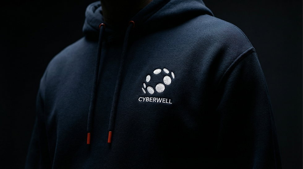
Swag wasn’t treated as an afterthought — it was an extension of the system. Every object reinforces Cyberwell’s core idea: clarity in complexity. The palette stays disciplined — deep navy as the foundation, with high-signal orange used sparingly. The mark is applied with restraint, reading as a quiet signal rather than decoration, while materials and finishes elevate even the simplest items.
From apparel and bags to stickers and kits, each piece is designed to live naturally in the real world — in offices, at conferences, on laptops — while consistently reinforcing the same visual language. No noise. Just signal.


Print Collateral
Print is where the system proves its discipline. Every piece — from business cards to multi-page reports — is built on hierarchy, clarity, and control. We developed a modular layout system that scales from simple one-pagers to complex, data-heavy documents, with typography leading and a restrained color system guiding attention.
Materials and production choices reinforce the brand’s presence: rich stocks, precise finishes, and subtle contrasts that reward close inspection. The result is collateral that feels as considered as the platform itself — organized, credible, and built for decision-making environments.


Outdoor Advertising
Outdoor is where the brand has to work instantly. We designed a system that cuts through noise with confidence and restraint, translating complexity into bold, legible moments. Large fields of navy create calm backdrops, while gradients and motion-inspired forms introduce energy without chaos.
Messaging is direct and declarative — built to be understood in seconds across streets, transit, and large-format displays. The mark operates as a beacon, ensuring Cyberwell shows up the same way everywhere: composed, precise, and impossible to ignore.


Tradeshow
The tradeshow environment is a physical expression of the platform — structured, immersive, and built for clarity. Every surface, from backwalls to banners, follows the same system, with bold navy fields, controlled gradients, and the mark acting as a central signal.
We designed a modular architecture that scales across footprints while maintaining consistency. The result is a presence that feels composed and confident, cutting through the noise of the show floor not with volume, but with clarity — a space that behaves like Cyberwell itself.


Platform Video
The platform video translates Cyberwell’s operating model into something immediate and understood, turning complex systems — networks, threats, and infrastructure — into connected, living environments you can follow in motion. Signal paths, data flows, and real-world applications across cities and critical systems all resolve into a single idea: total visibility through one platform. Built in the brand’s visual language of deep navy and high-signal orange, information lights up, connects, and clarifies, while grounded UI moments show CYDEcore™ as real control, not concept — making the invisible visible and the complex legible.


