Hula Polish
Transforming a product concept into a fully realized, emotionally driven lifestyle brand. We built a complete brand world inspired by the warmth, freedom, and optimism of the Hawaiian Islands, crafting a premium beauty experience that encourages self-expression and adventure.

Hex
RGB
CMYK
OKLCH
#FF7E73
255, 126, 115
0, 51, 55, 0
0.74, 0.16, 27
Hex
RGB
CMYK
OKLCH
#83E6D3
131, 230, 211
43, 0, 8, 10
0.86, 0.10, 180
Hex
RGB
CMYK
OKLCH
#EFD5BE
239, 213, 190
0, 11, 21, 6
0.89, 0.04, 64
Hex
RGB
CMYK
OKLCH
#F7F2EC
247, 242, 236
0, 2, 4, 3
0.96, 0.01, 73
Hex
RGB
CMYK
OKLCH
#2A1D22
42, 29, 34
0, 31, 19, 84
0.25, 0.02, 354
Title for overview section
Lorem ipsum dolor sit amet consectetur. Malesuada sed ultricies non sed a. Quisque fermentum lobortis augue fringilla pellentesque in augue turpis. Sagittis ut nunc sapien scelerisque tristique est est. Egestas vitae amet varius amet. Scelerisque lacus dignissim condimentum dignissim ornare. Eleifend placerat lectus ultricies blandit fermentum. Volutpat parturient aliquet diam sed eget.

Brand System
A scalable visual identity engineered to blend playful tropical energy with high-end aesthetic appeal. Anchored by elegant typography and custom illustrated marks inspired by Hawaiian flora, the system establishes an unmistakable signature across all platforms while giving the brand room to grow.
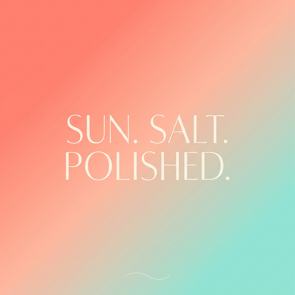
Collected Moments
A foundational color system designed to evoke the organic energy and beauty of Hawaii. Drawing from coral reefs, island sunsets, and tropical blooms, each distinctive polish shade supports powerful product storytelling while maintaining instant brand recognition.


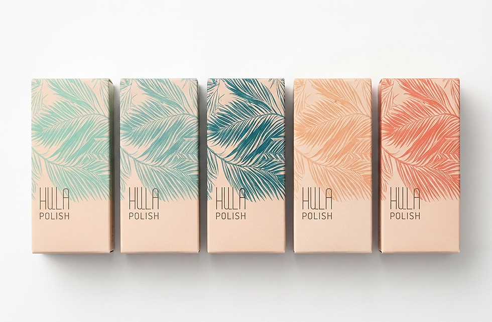
Souvenirs from Paradise
Premium bottle and structural carton designs built to ensure maximum shelf impact and collectibility. Utilizing custom illustrations, soft gradients, and high-end finishes, the custom packaging delivers a memorable, highly shareable unboxing experience.


Immersive Escapes
A cohesive system of bright campaign graphics and lifestyle-driven digital storytelling. Designed to stand out in a crowded beauty market, these creative assets invite the audience directly into the brand's world—one defined by color, confidence, and adventure.


Platform Video
The platform video translates Cyberwell’s operating model into something immediate and understood, turning complex systems — networks, threats, and infrastructure — into connected, living environments you can follow in motion. Signal paths, data flows, and real-world applications across cities and critical systems all resolve into a single idea: total visibility through one platform. Built in the brand’s visual language of deep navy and high-signal orange, information lights up, connects, and clarifies, while grounded UI moments show CYDEcore™ as real control, not concept — making the invisible visible and the complex legible.