Mastercraft
From pencil sketch to production dash: the industrial UX behind the first multi-display instrument panel ever shipped in a MasterCraft towboat — designed, wireframed, and rolled out to market across the entire 2016 fleet.

A first, for one of boating's biggest names
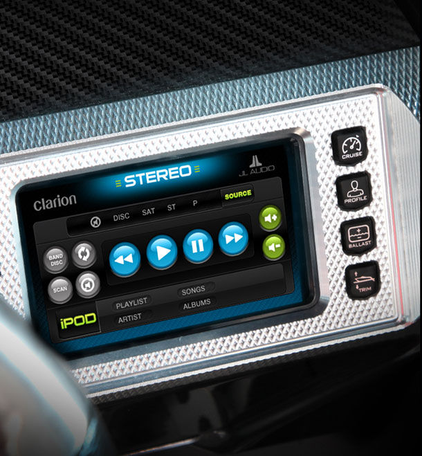
When MasterCraft set out to reinvent the towboat dash, they came to us with a blank page and a hard brief: build the first multi-display instrument cluster ever put into one of their boats, and make it feel like it belonged in a 2026 sports car, not a 1996 runabout. We worked shoulder-to-shoulder with MasterCraft's engineers and stakeholders from the first pencil sketches through production — wireframing the interaction model, designing every icon and graphic, testing it against real on-water conditions, and rolling it out across the entire fleet.
The flagship XStar was the halo. Its dash included a hideaway pop-up center display flanked by two more screens on either side of the steering wheel — a configuration truly in a style class all its own, with a dash like nothing else out there, including those on other MasterCraft boats. The system also scaled down: the same design language carried through the HV700, HV450, ProStar, and NXT dash variants, giving MasterCraft one visual vocabulary across an entire lineup of boats.

Sketch, wireframe, ship
Designing a marine UX isn't like designing an app. The dash has to read at a glance in full sun, survive spray and salt, and give a driver pulling a wakeboarder at 22 mph the exact information they need without a second thought. We started with pencil sketches alongside MasterCraft's engineering team, moved through wireframes that mapped every tap, every state, and every alert, and designed a complete icon and graphic system built for legibility at speed. Every screen was tested, iterated, and then handed off for production — a full design system that now ships in every 2016 MasterCraft that leaves the factory.